If you are in the process of creating a brand and choosing your corporate colours, introducing a new product or planning your marketing materials, you need to look further than personal preference. You can take inspiration from seasonal colour trends, but you should also take on board the influence that colour can have on the psychology of potential customers.
Why colour matters
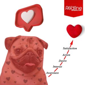
You probably have a rudimentary understanding of the psychology behind colour and take it as read that it can help set a certain mood. For example, most people associate pale blue with calm and yellow with happiness, but it goes much deeper than that. Colour is critical, as it can actually influence a decision to buy a product or whether visits turn into likes etc. Science has shown that colour really does influence customer behaviour by evoking emotions and associations *. Suggesting that the more you understand about these triggers the more you can influence your buyers. So choose carefully.
When designing a corporate identity you will need to consider longevity, so you wouldn’t necessarily base your colour choice on seasonal trends. But you can still be guided by the proven psychological effects of colour. And you can incorporate both the psychology and the seasonal colour trends into your marketing campaigns and new product lines, whilst still remaining true to your brand.
Of course, our recommendation would always be to add a touch of Red…..
*Research by Satyendra Singh, University of Winnipeg, Canada has shown that colours can increase or decrease appetite, enhance mood, reduce the perception of waiting time.
Consumer colour survey
90 seconds – is all it takes to make a subconscious decision
42% – more people will read a colour advert than an identical black and white advert.
8 out of 10 people say colour makes a brand more recognisable.
85% of consumers identify colour as the primary influence when buying a product.
90% of that decision is based on colour.
Information provided by WebpageFX.
Psychological Colour Guide
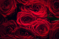 |
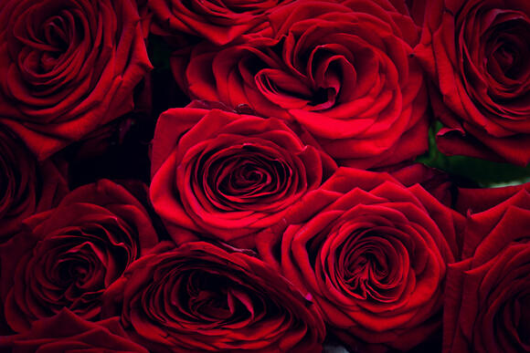
RED – strength, passion, love, increased heart rate- perfect for creating urgency and impulse buying. Used for ‘sale’ signs and to stimulate appetite. In some circumstances it signifies caution. |
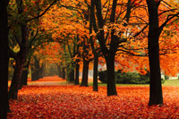 |
ORANGE – action; sign up, sell or buy.This is a cheerful colour that conveys enthusiasm and stimulation. Like red, it is a popular and effective call to action. It is also used for sales and for prompting impulse buys. Also, similar to red it can also suggest caution. |
 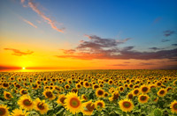 |
YELLOW – optimism, hope, youth, happiness, warmth, light, communication – however it can over-stimulate the nervous system and cause eyestrain. It is often used for attention in shop windows. |
  |
BLUE – Pale blue signifies continuity (think sky and sea) calm, peace and trust. The most popular colour amongst men and most commonly used in corporate branding, particularly in finance, insurance and health companies where trust and efficiency are vital. It can also curb the appetite. |
 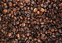 |
BROWN – brown is a very popular colour. It suggests warmth, nature and also wealth. Browns denote the earth and warmth, whereas black and dark grey suggest luxury, wealth and quite often stability. |
 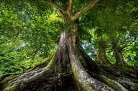 |
GREEN – the human eye can differentiate more shades of green than any other colour. It’s also the colour of health, harmony, tranquillity and nature, for this reason it is often associated with farming, organic products and fuel. It is of course the colour used in traffic lights for go! |
 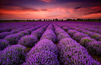 |
PURPLE – a regal colour associated with wealth (as purple dyes – a mix of red and blue – were only available to the wealthy), often used for advertising food, beverages and also products aimed at women. |
Used for ‘sale’ signs and to stimulate appetite. In some circumstances it signifies caution.
Trends for Spring/Summer 2015
| Female colour preference Strawberry Ice Marsala Scuba Blue Classic Blue Lucite Green Tangerine Toasted Almond Custard Aquamarine Glacier Grey |
Male colour preference Toasted Almond Sandstone Marsala Lavender Herb Woodbine Treetop Classic Blue Dusk Blue Glacier Grey Titanium |
This spring we’ll see a move towards the softer side of the spectrum with an interesting mix of bright colours, pale pastels and neutrals reminiscent of simpler times. Retro, floral and folk art and magical tropical landscapes will be part of the picture.
“Many feel compelled to be connected around the clock because we are afraid we’ll miss something important. There is a growing movement to step out and create ‘quiet zones’ to disconnect from technology and unwind, giving ourselves time to stop and be still. Colour choices follow the same minimalistic theme, taking a cue from nature rather than being reinvented or mechanically manipulated. Soft, cool hues blend with subtle warm tones to create a soothing escape from the everyday hustle and bustle.”*
*Leatrice Eiseman, Executive Director of the Pantone Colour Institute